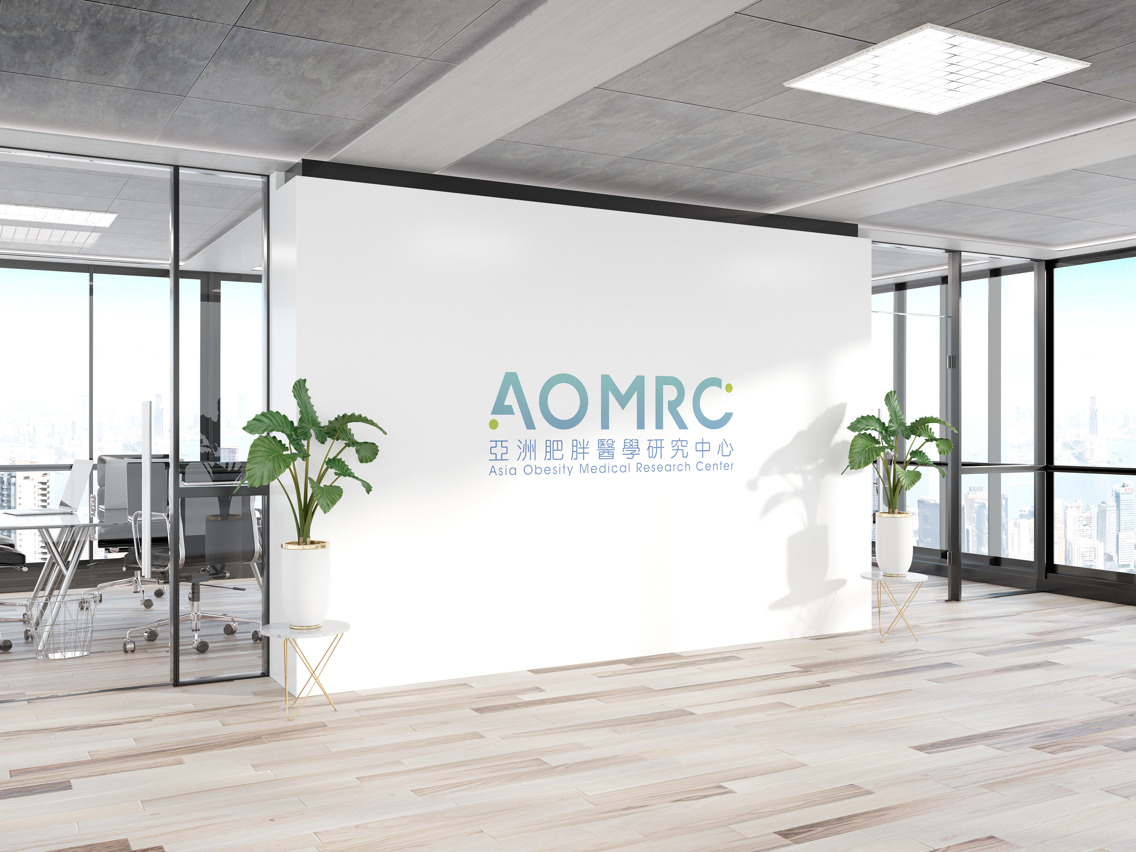
Design Concept:
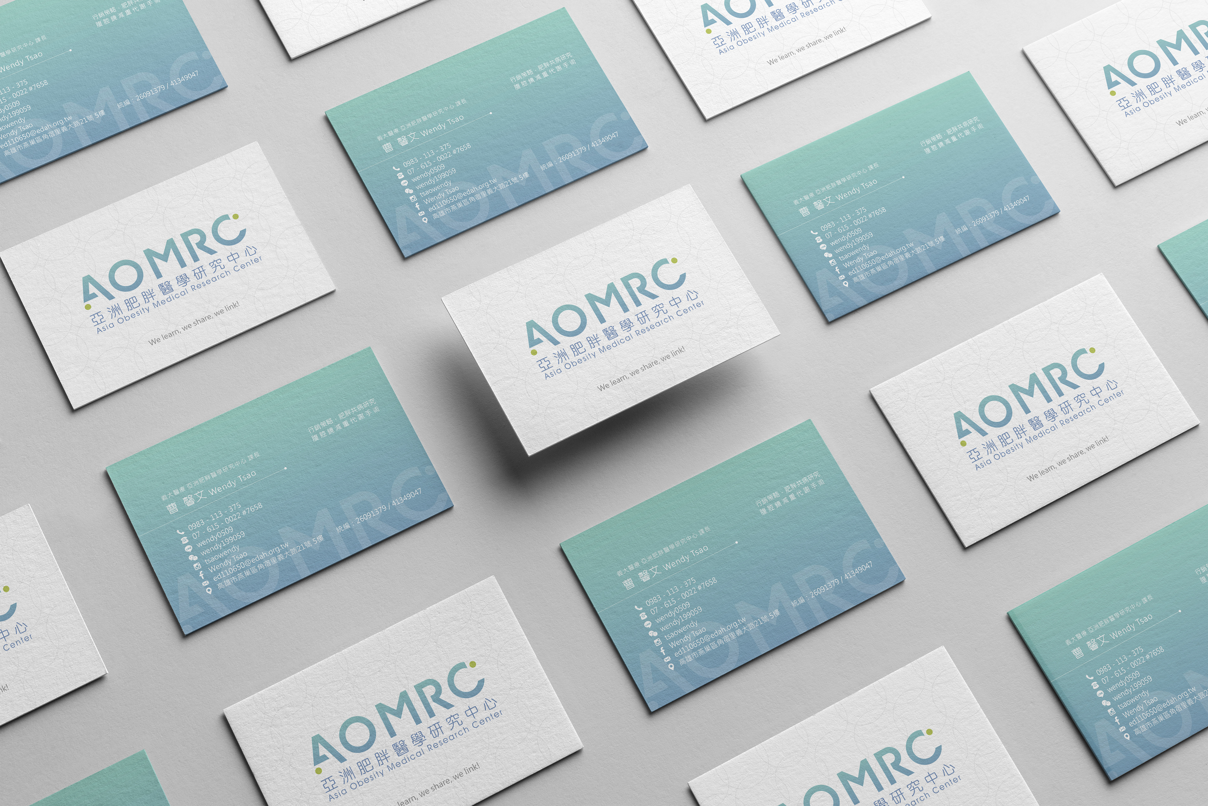
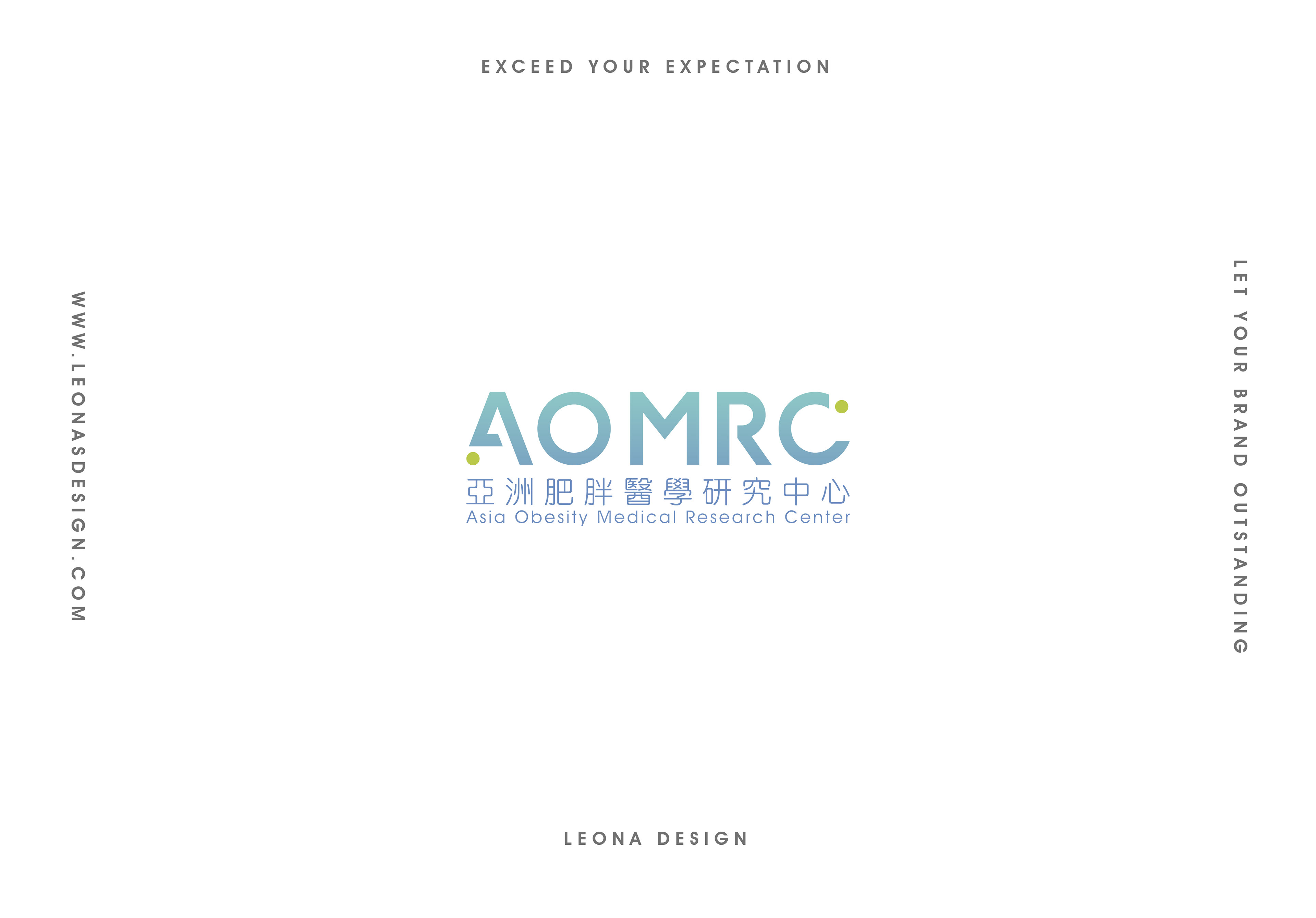
此Logo設計風格為西方現代、簡約俐落、前衛風格,以貴品牌名稱簡寫AOMRC做英文字體設計logo,以幾何線條及圓形,依照美學比例,精心繪製出此logo,讓人一目瞭然,立即辨識出貴品牌,並且留下深刻記憶。文字設計中,將A及C結合兩個圓,象徵著AOMRC與病患之間的連結,對角的設計,與視覺中心M交接,平衡整體視覺畫面比例,也象徵著來AOMRC,為每一位患者開啟不一樣的人生大門(M);更為整體穩重、專業的品牌視覺中,也帶入一點活潑;整體設計有別於亞洲同產業傳統logo設計,此logo更顯吸睛、突出。
The style of this logo is western, simple, clear and contemporary. AOMRC is the abbreviation of Asia Obesity Medical Research Center and using AOMARC to design and create a new font as the logo lets people immediately be attracted and recognise the brand identity. There are two circles in the logos, which presents the connection between AOMRC and patients. M is in the middle and it balances the typography and means a door that AOMRA always helps every patient to open a new door in life.