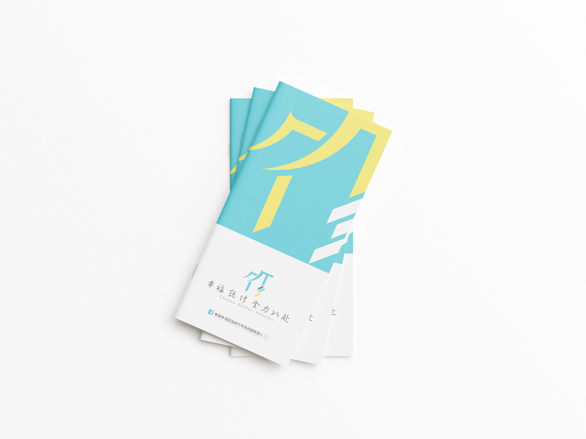
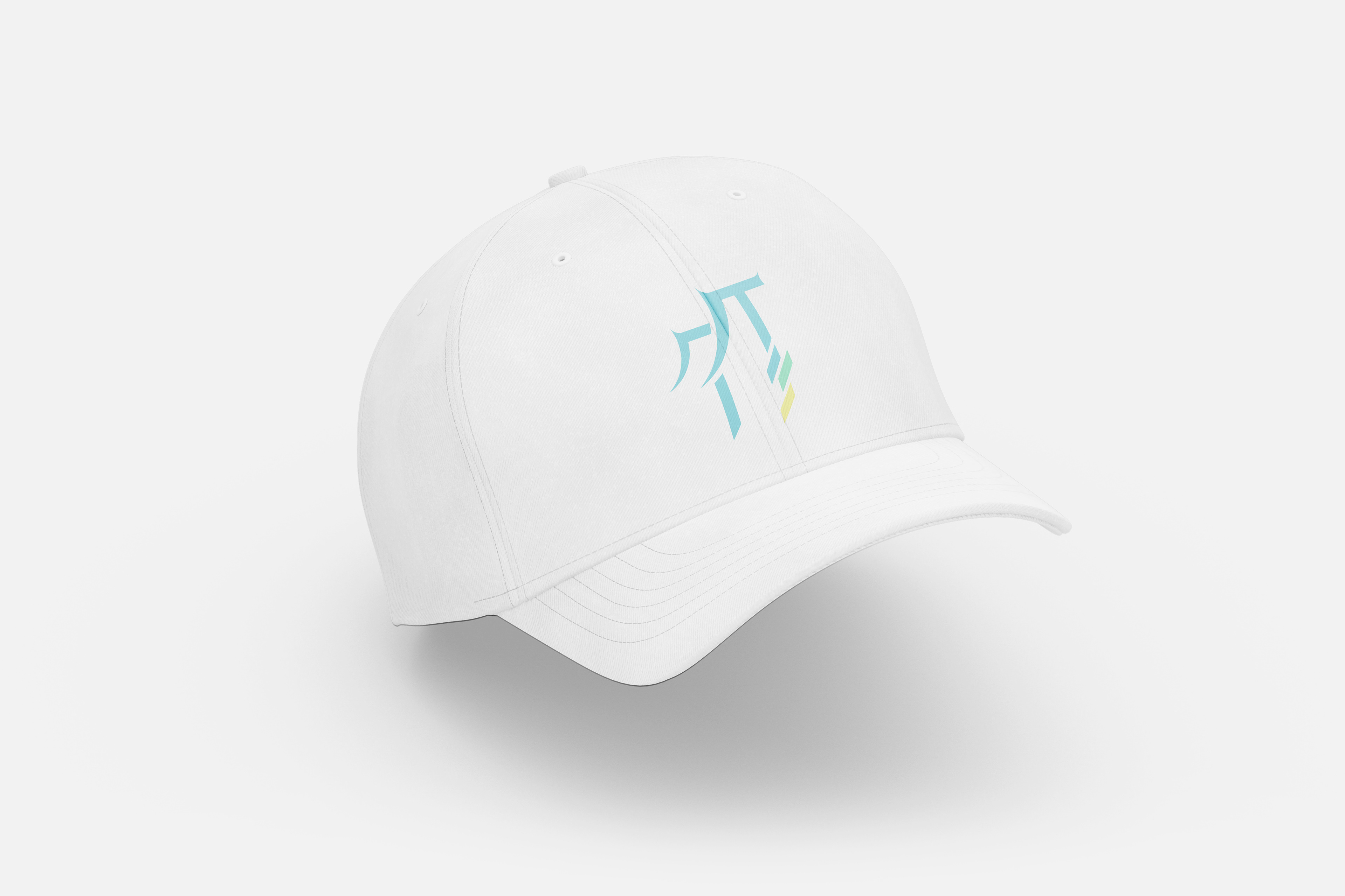
Design Concept:
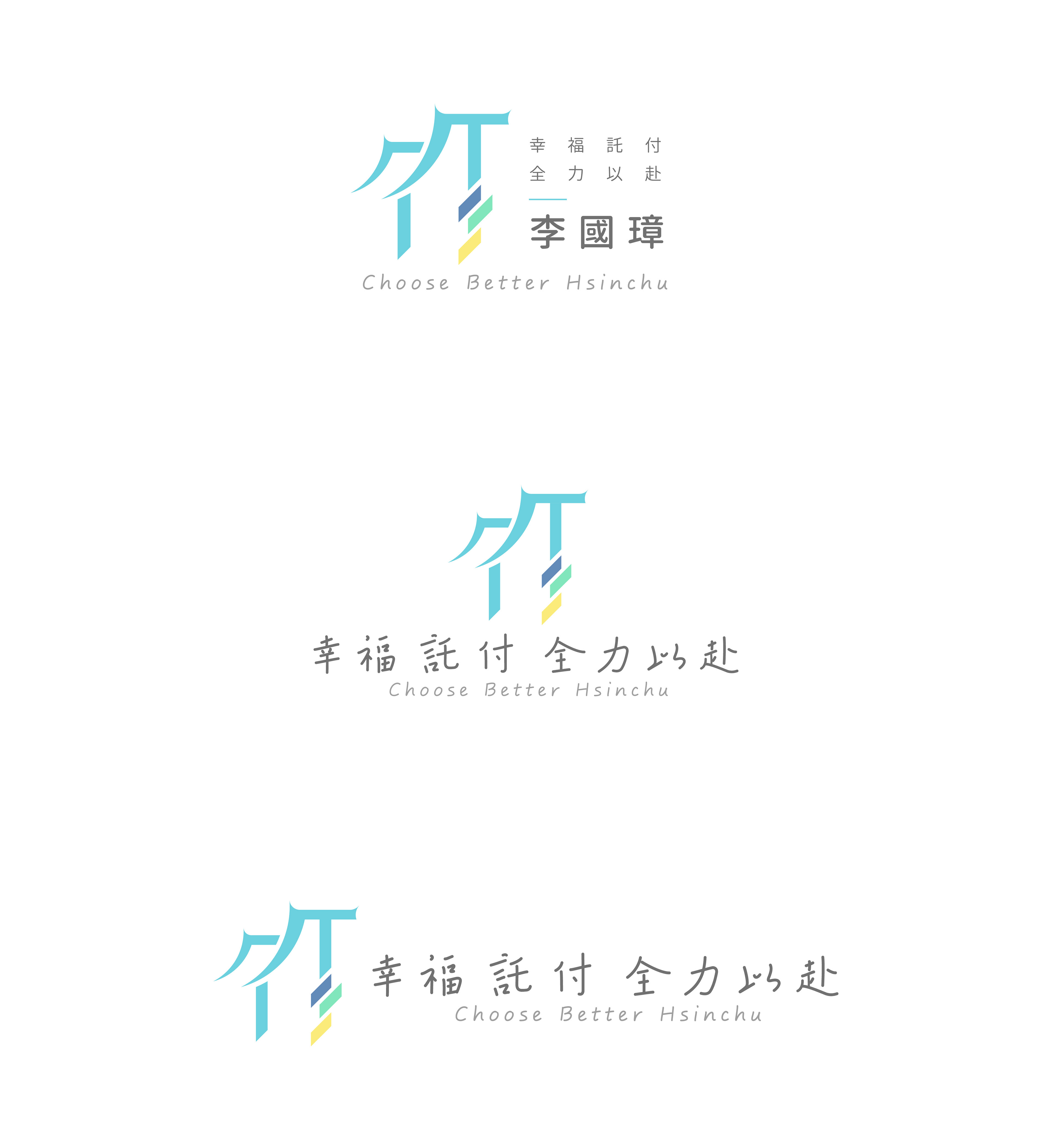
此Logo設計風格為現代簡約、西方俐落、時尚活潑風格。以新竹之「竹」字作為整體視覺設計主軸,以幾何線條及圓形,依照美學比例精心繪製出此logo。將竹一字巧妙的與新竹代表東門城屋簷特色作為結合,象徵新竹在地著名地標,並且將竹北、竹南、竹東一併帶入,傾斜45度角,完美比例,象徵共同前進、一同邁向更好未來!竹字兩部分上下交錯,除了象徵著東門城屋簷之層次感,更是代表著人民、人與人之間的互動,一同在李國璋的帶領下,邁向幸福新竹、超群出眾之精神!簡約俐落的設計,讓人一目瞭然,立即辨識出貴品牌所在地及獨有的品牌形象,留下深刻印象,更是有別於亞洲同產業傳統logo設計,此logo更顯簡約俐落、專業質感、高端新穎。且此logo提供多種排版設計,使應用上可以更加廣泛,不受侷限,完美體現貴品牌獨有的品牌特色及故事。
標準文字設計上,為設計字體,以親筆手寫字體作為呈現,營造出人情、溫度、幸福之氛圍,也鎖定女性族群,在專業的整體視覺風格中,又帶入溫柔、生活、貼近人心的溫度感,搭配此logo,使整體畫面更加協調。
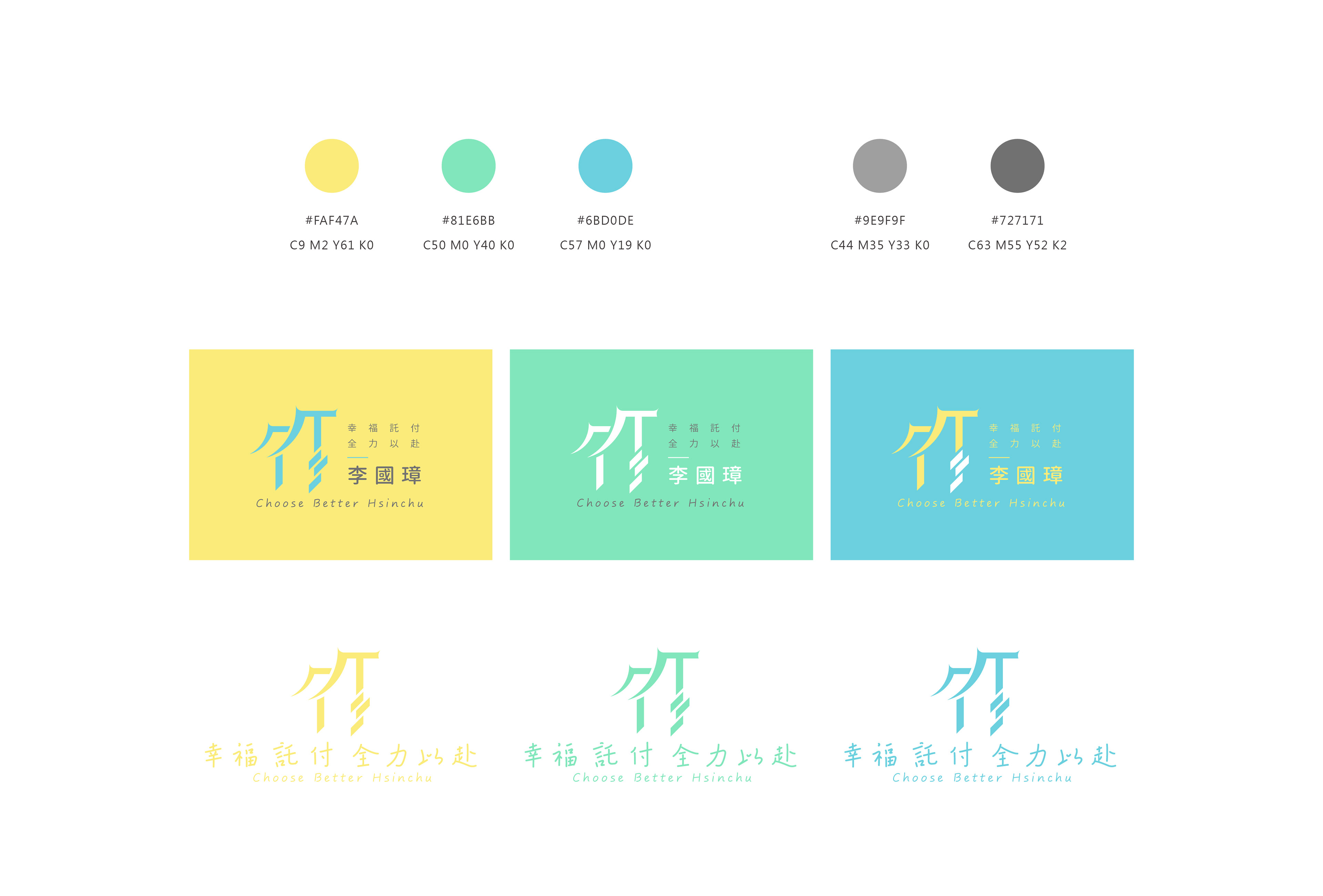
色彩搭配上,主logo配色以高明度、飽和度之藍、綠、黃色系作為搭配,高明度配色,使整體更加輕盈、活潑、年輕有活力,呼應女性族群TA,完美體現貴品牌獨有的品牌形象。
The style of this logo is simple, stylish, clean, and a combination of Eastern and Western. The Chinese character is the second word of the city's name, Hsinchu. Using the Chinese word as the main image in the logo and combining the specific feature of the famous attraction, East Gate of Hsinchu, lets people immediately recognise the extraordinary brand identity. The logo is combined with eastern and western style, which brings an atmosphere of international and global feelings. Compared with other brands' identities, this logo is more outstanding and special.
-
Director: Leona Kuo
Designers: Leona Kuo and Alisa Jiang