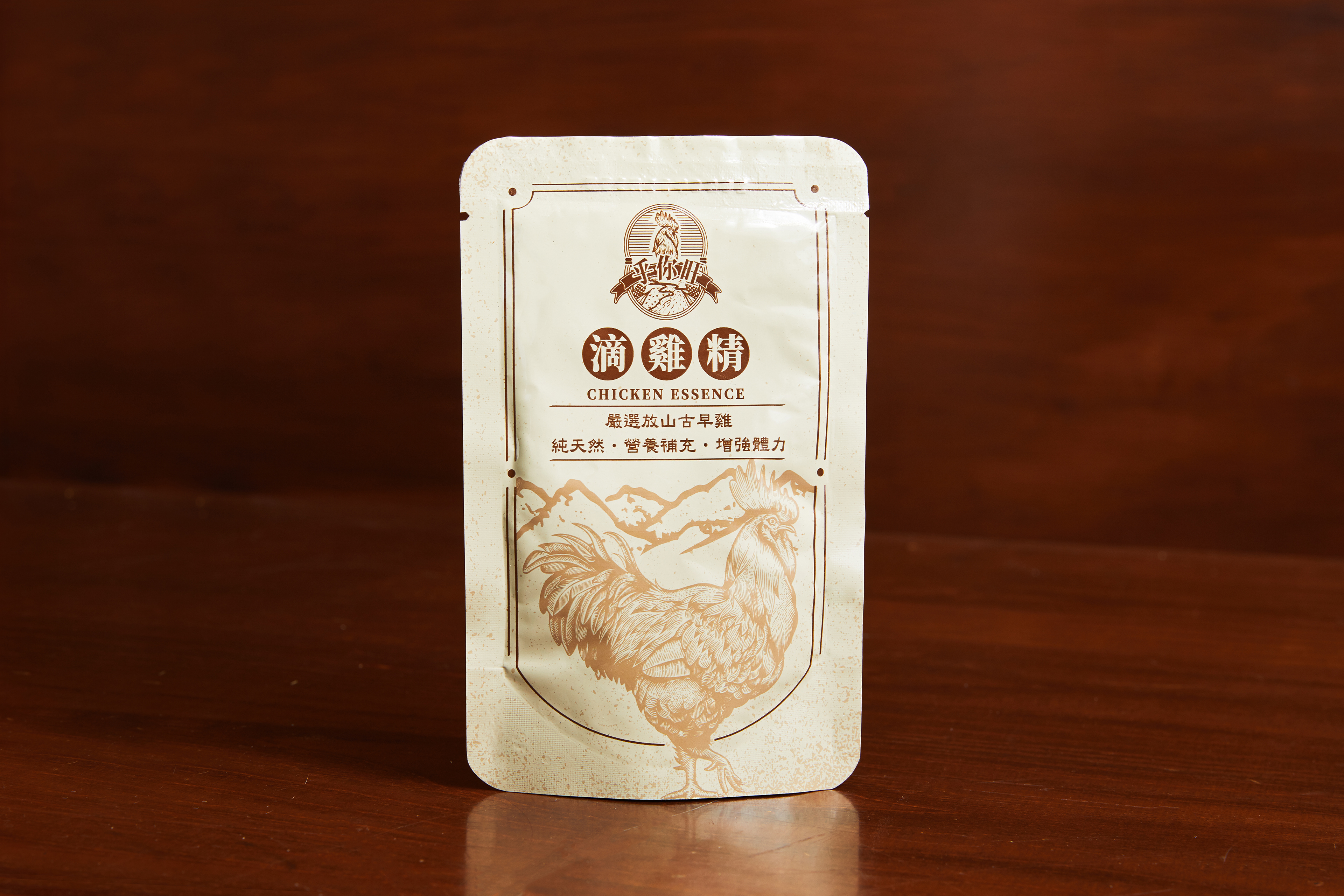
Design Concept:
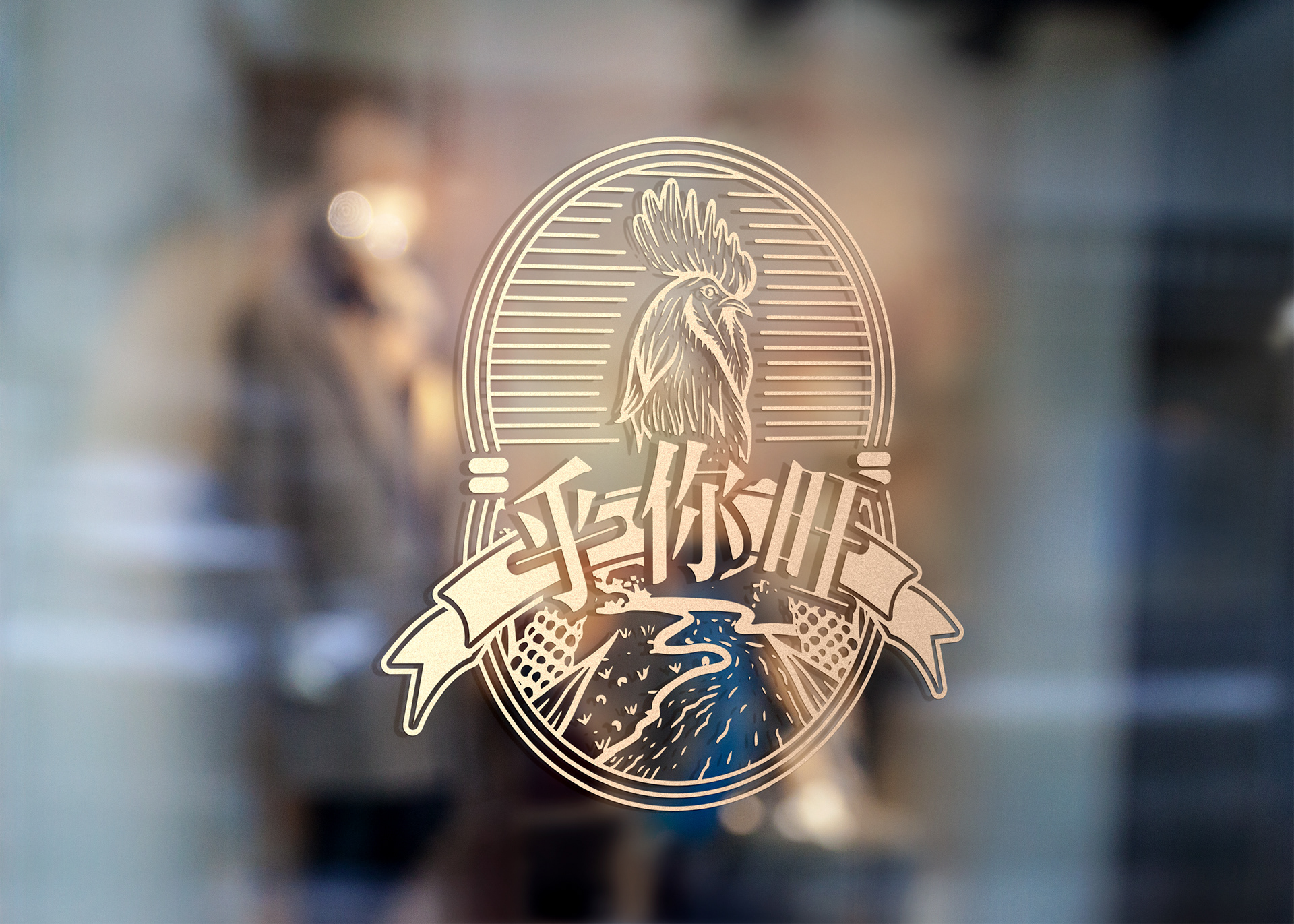
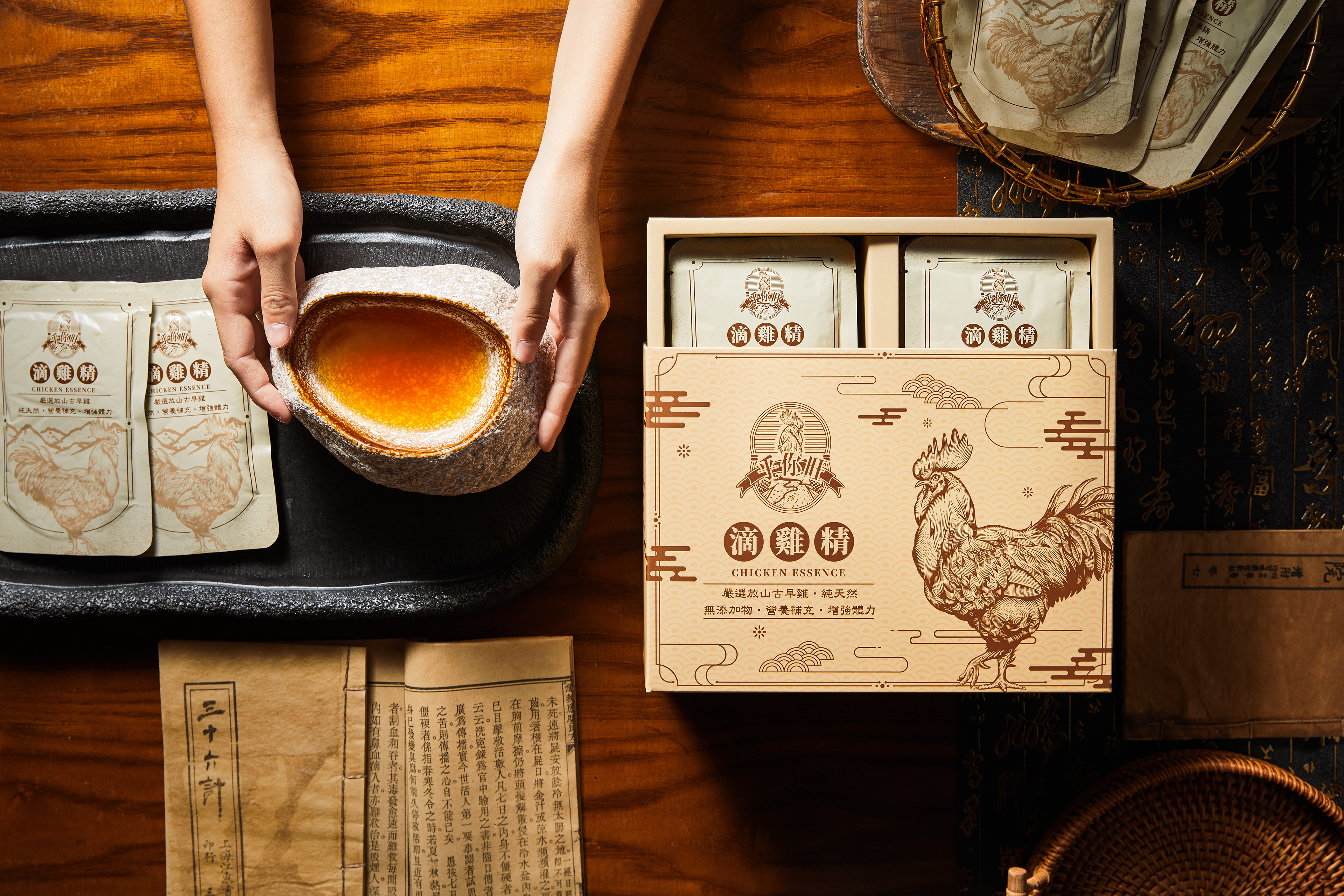
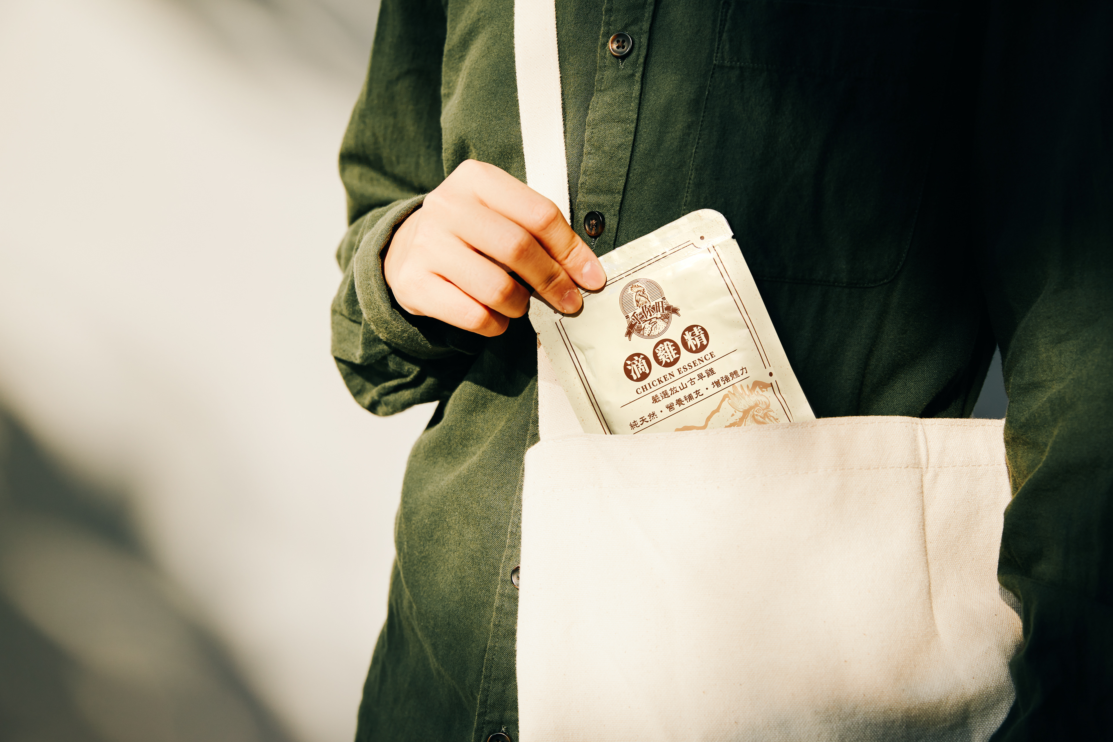
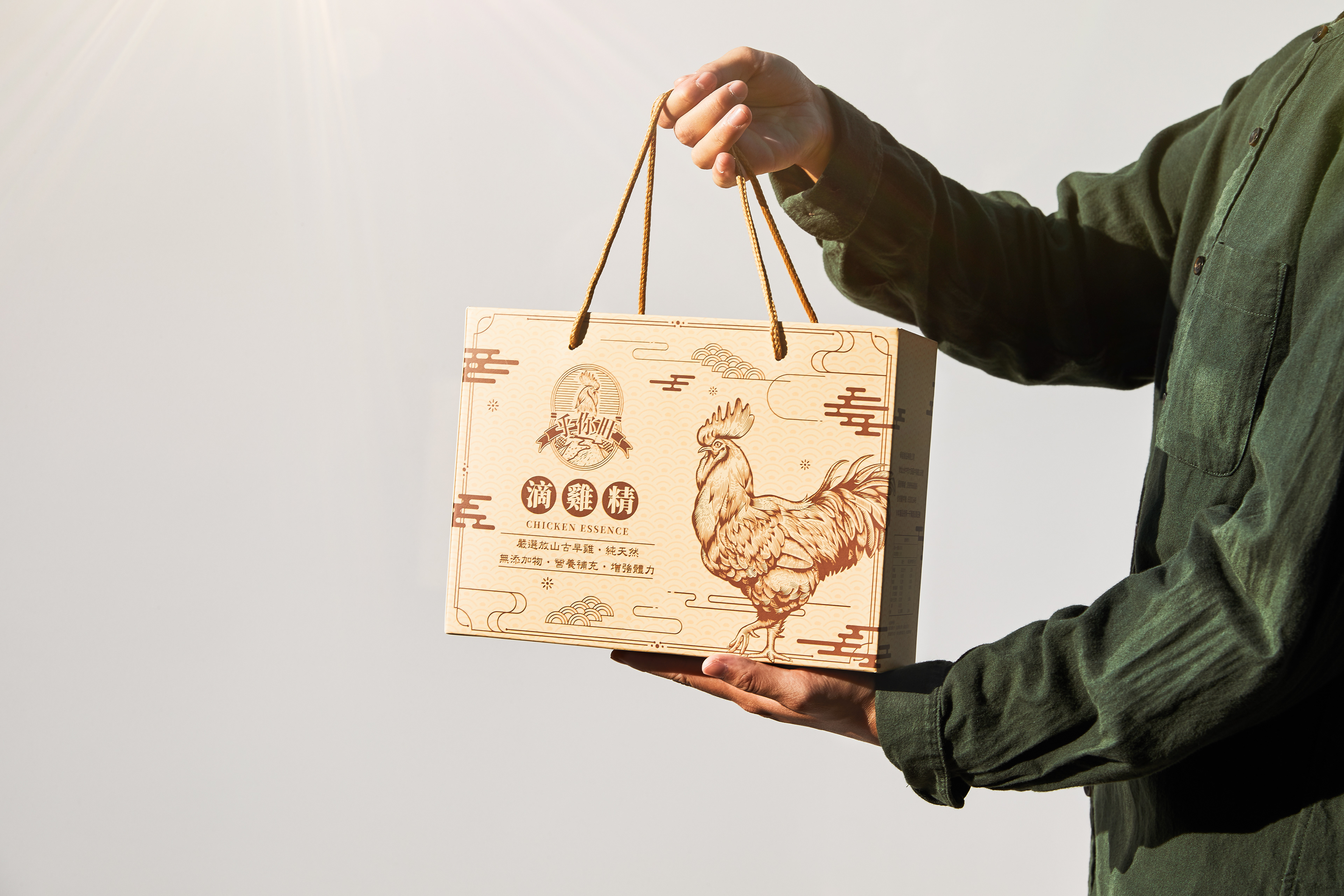
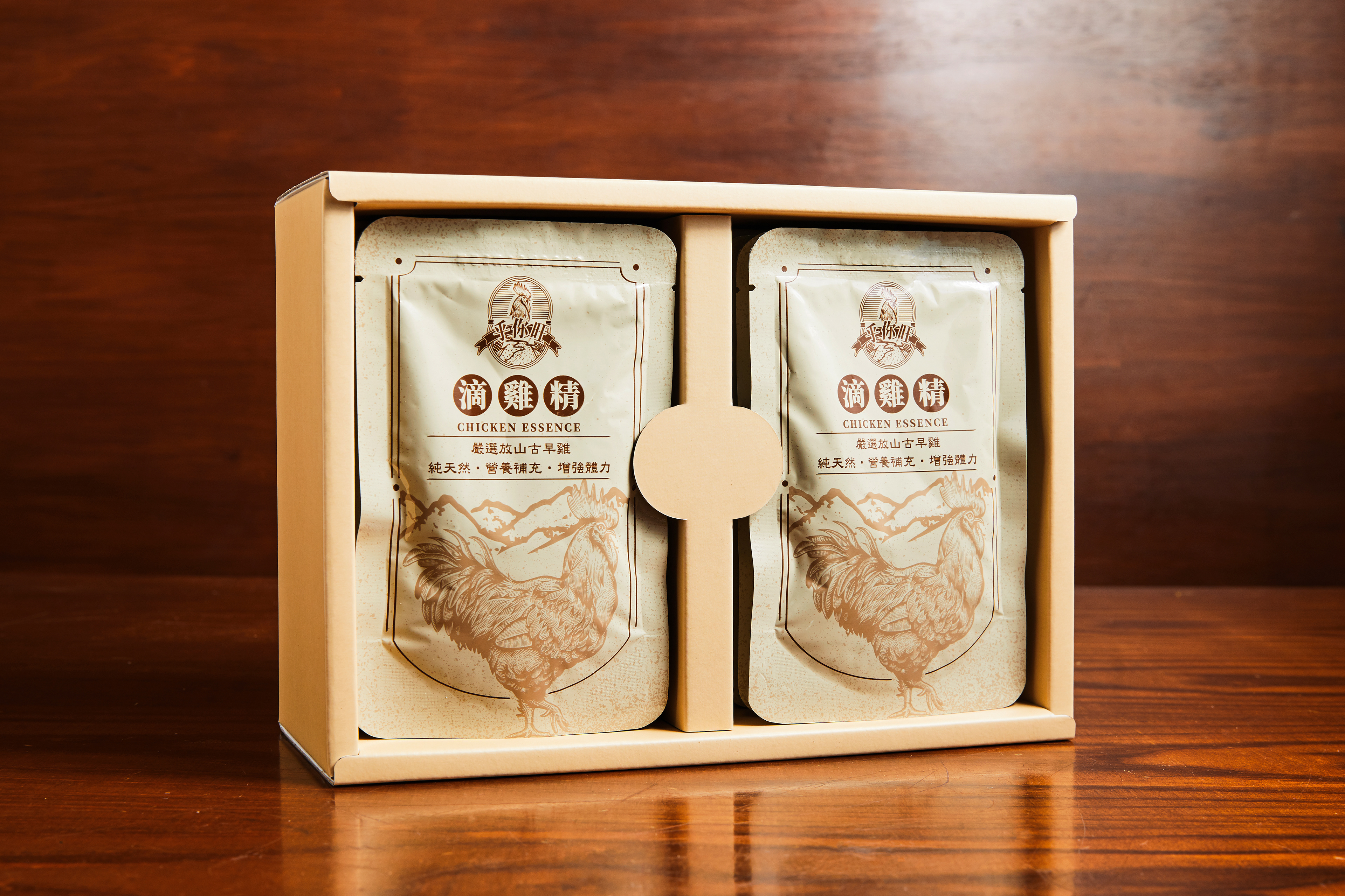
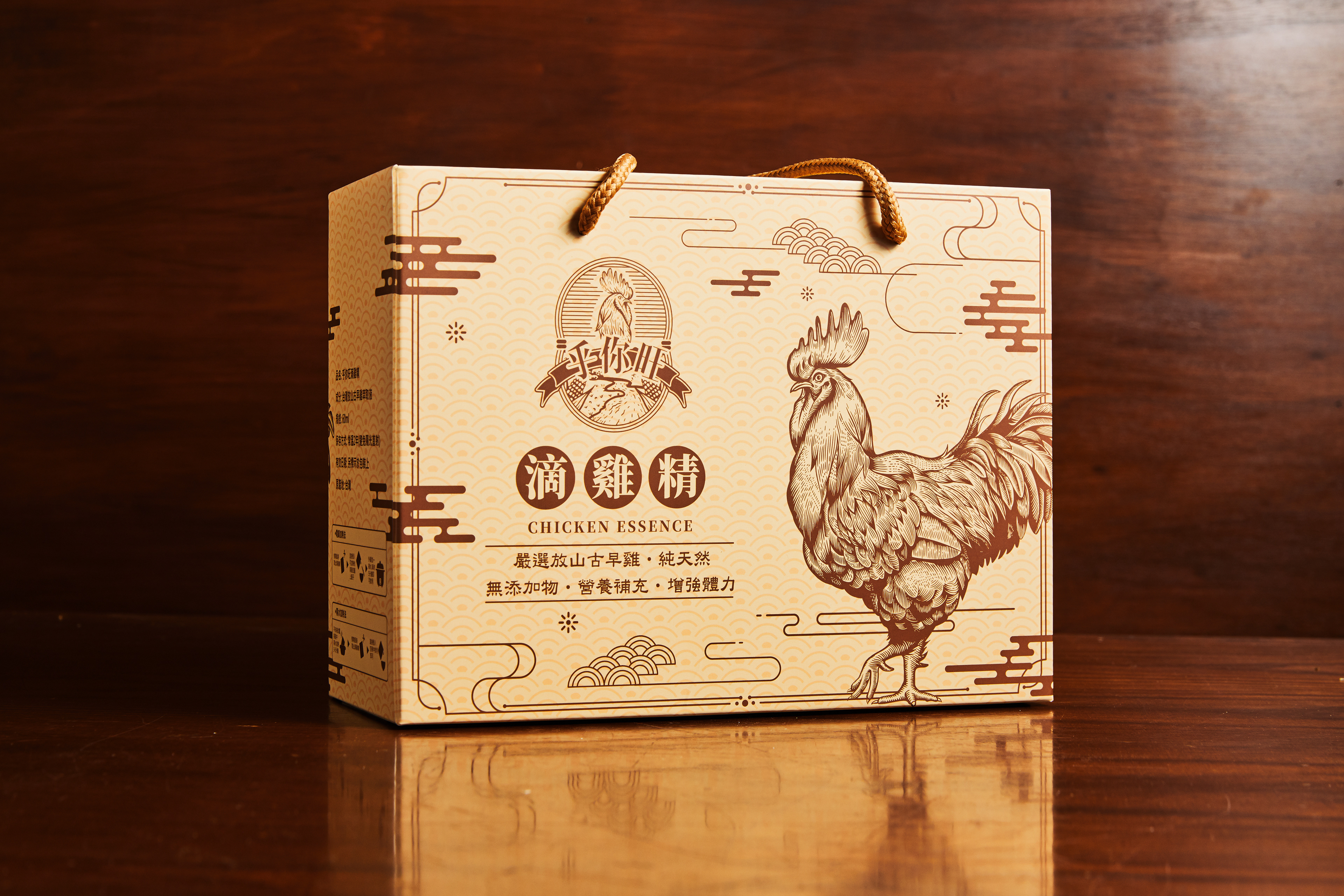
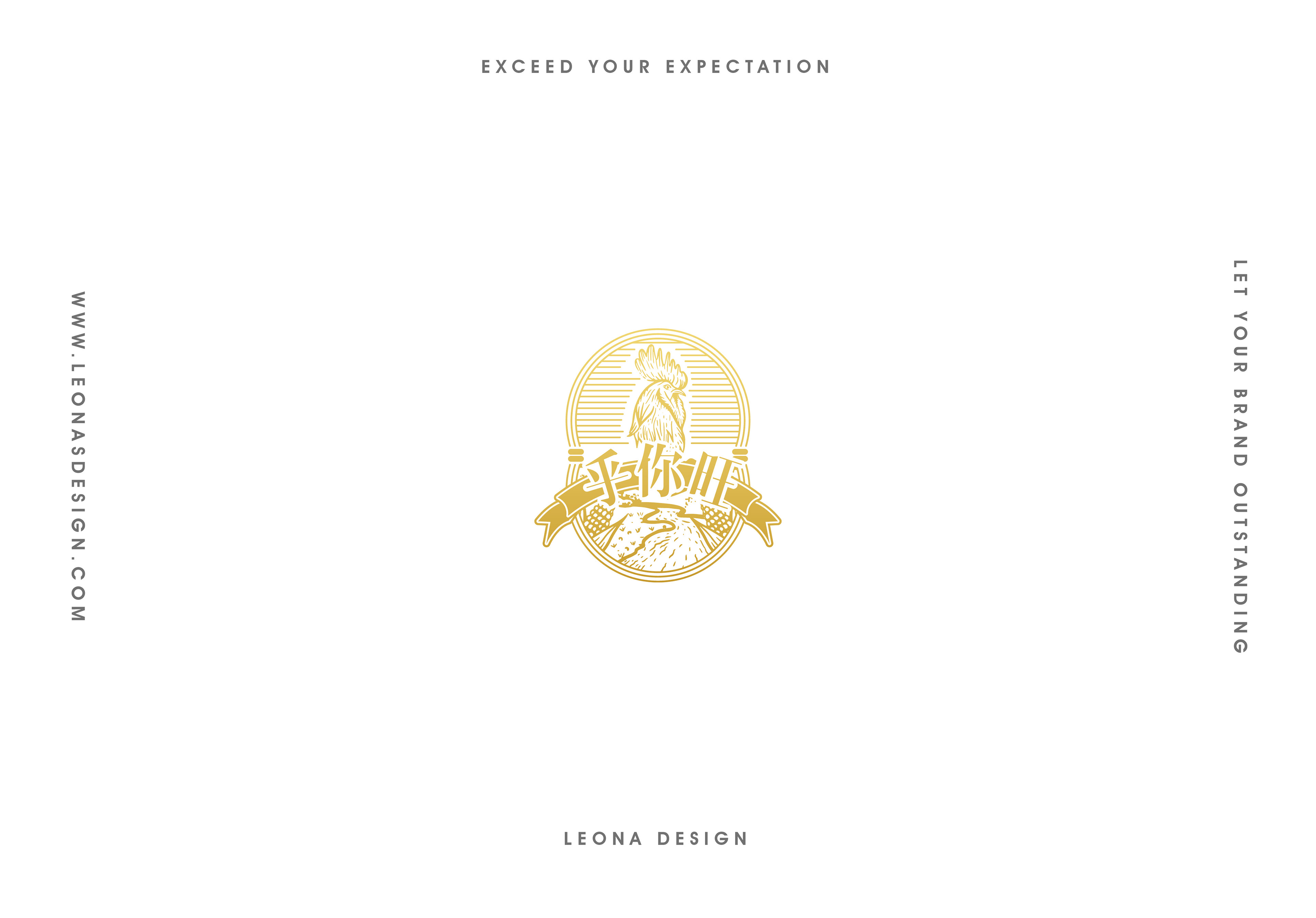
此Logo設計風格為東方、復古文青風格。以半寫實插畫呈現,帶給人除了精緻、吸睛的視覺感受,最重要的是傳遞出滿滿的溫度及人情味。以霸氣的公雞作為整體視覺焦點,讓人一目瞭然,可以立即辨識出貴公司產業別,並且將其公司名稱融入於logo之中,使人輕鬆留下深刻印象。將飼養雞的酒糟、玉米意象結合至其中,代表著貴品牌對於產品品質的堅持及把關,任何一個小細節都十分講究。整體以復客復古的風格,再結合段帶,文字以圓弧呈現,特別凸顯出貴品牌獨特產品名稱,營造出旺旺來的感覺。
The style of this logo is retro and oriental. Sketching a rooster as the main image lets people immediately recognise the company's industry and brand identity. In the logo, corns and grains mean that the company has high persistence and determination of every process and quality, providing chicken with good food and the environment, so that is why they can produce the best chicken essence.