Design Concept:
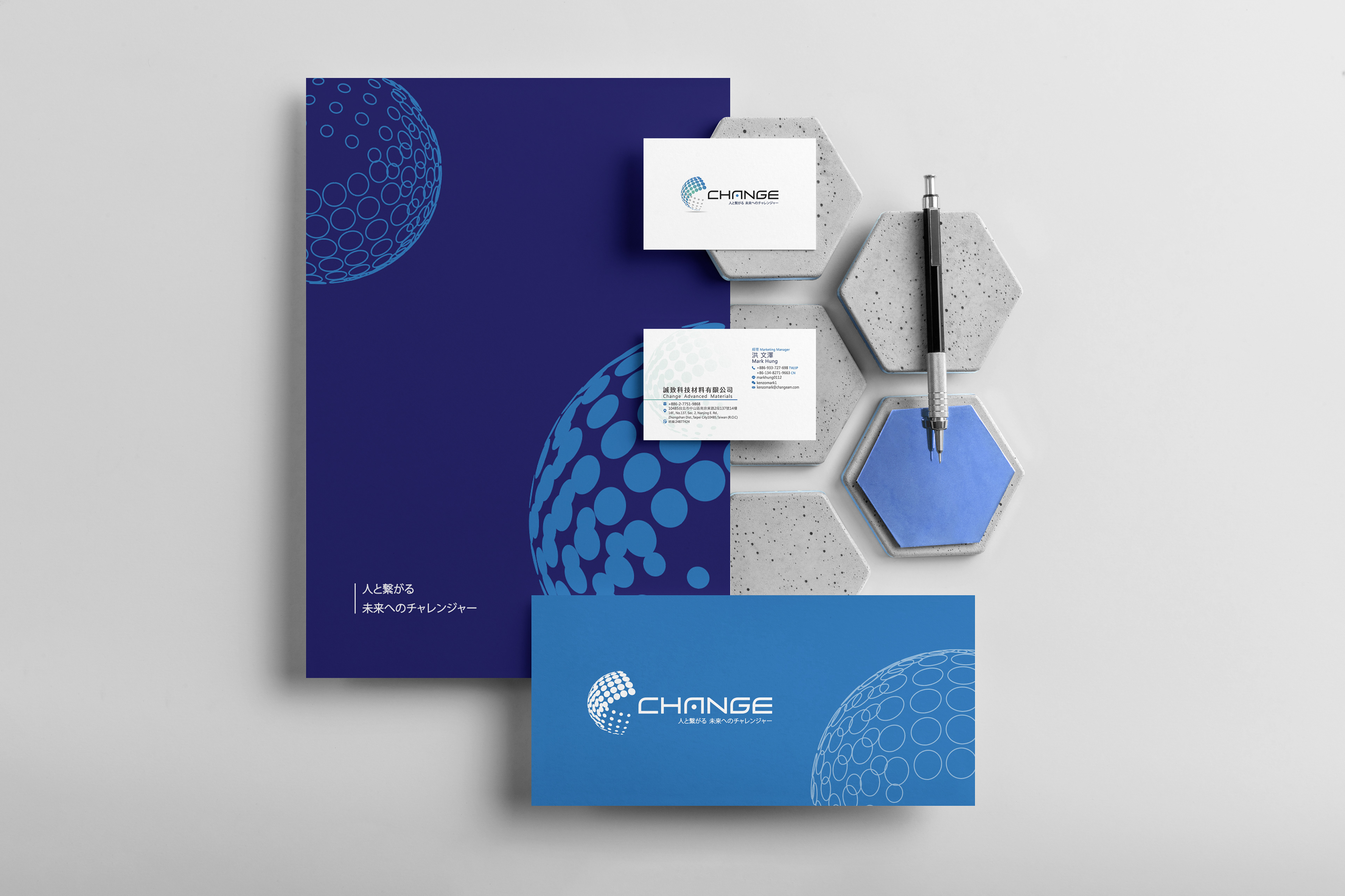
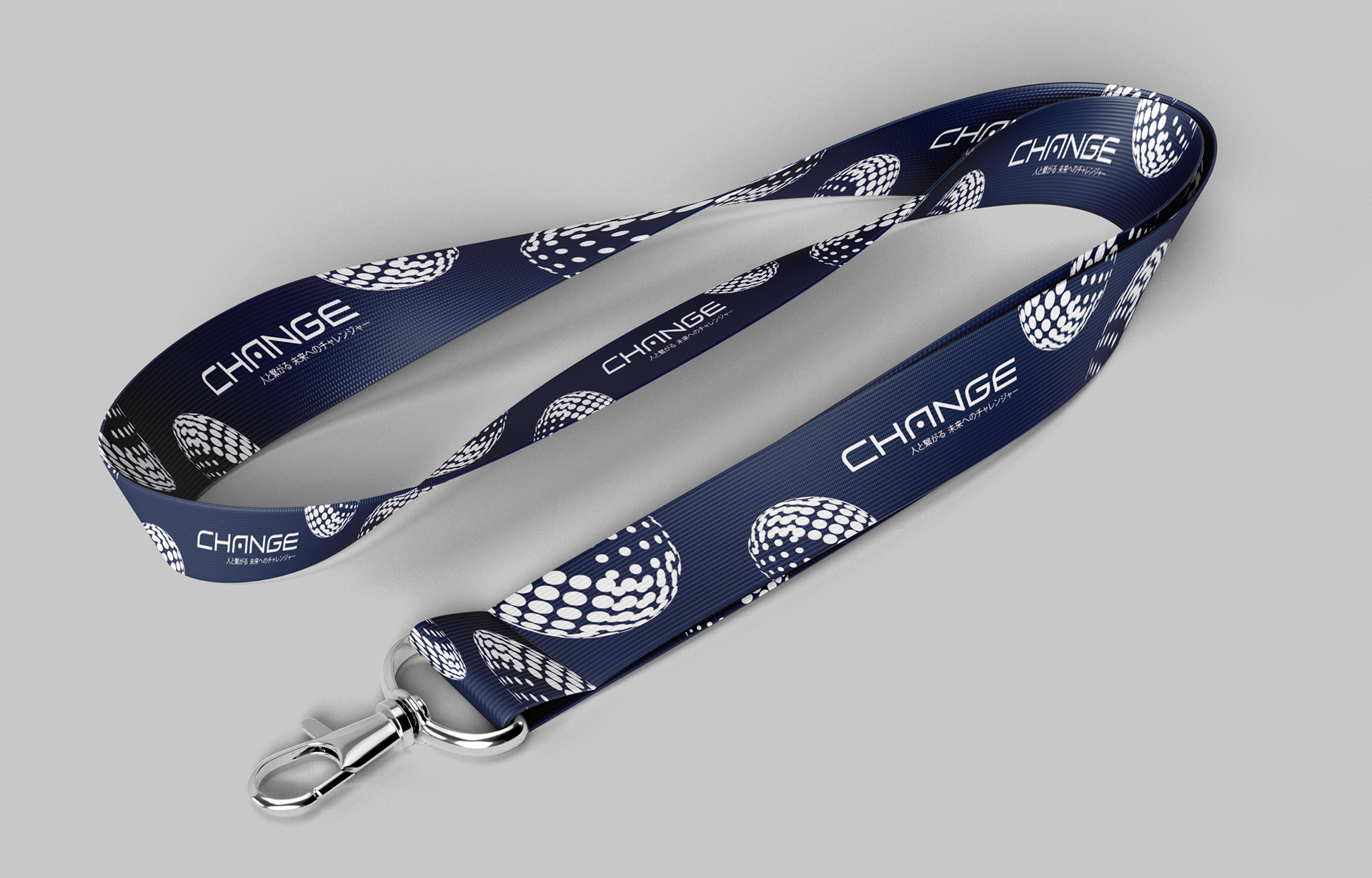
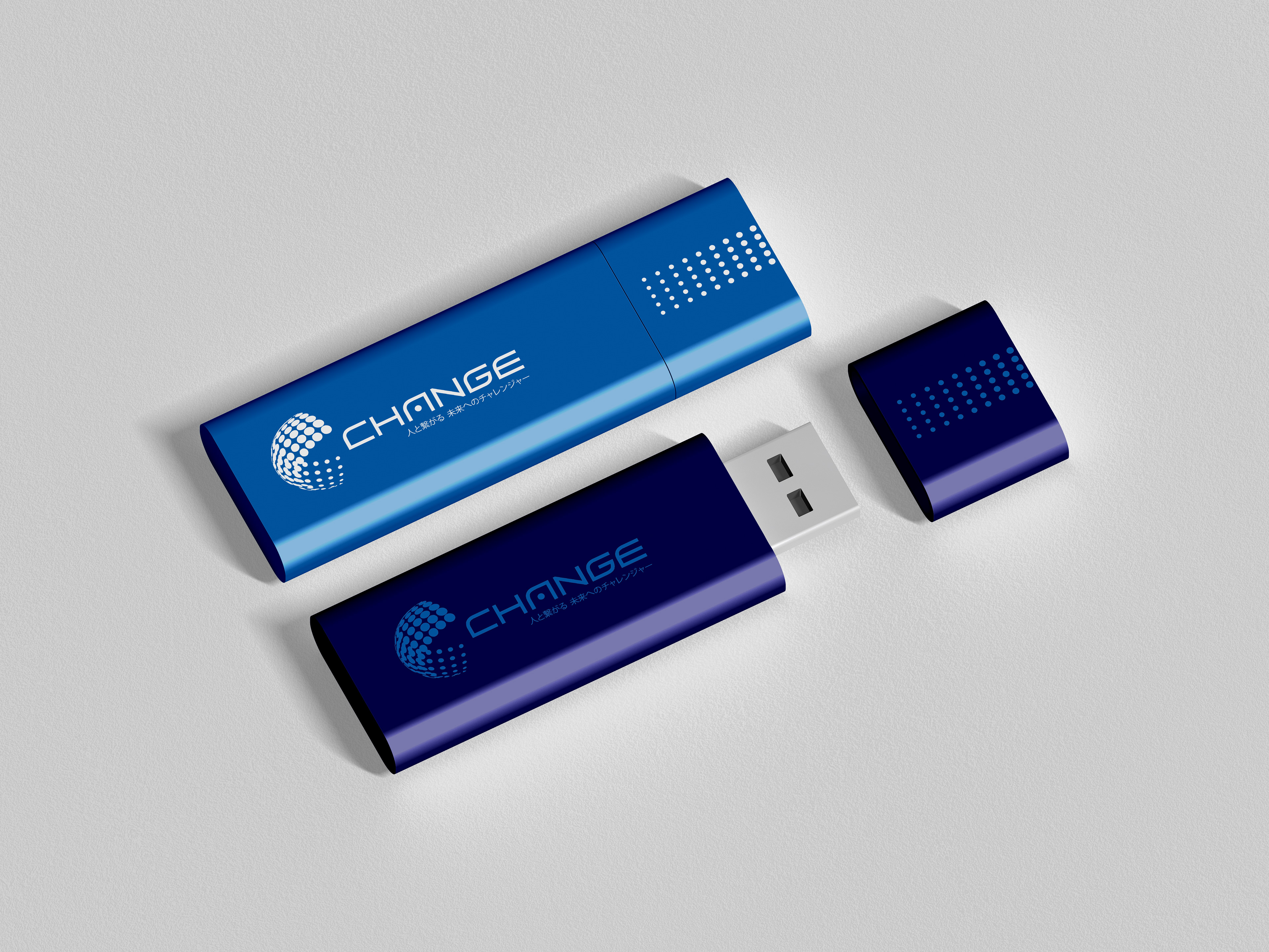
此Logo設計風格為西方現代、簡約俐落、穩重專業風格,以貴品牌名稱開頭縮寫C做英文字體設計logo,以幾何線條及圓形,依照美學比例,精心繪製出此logo,讓人一目瞭然,立即辨識出貴品牌,並且留下深刻記憶。logo設計中以多個圓形做旋轉變化構圖,呼應「改變」一詞,並且運用漸層上色手法作為呈現,為整體畫面增面立體感、層次感、空間感,整體設計有別於亞洲同產業傳統logo設計,此logo更顯吸睛、突出;整體基本行為圓形,圓形logo往往帶給人圓融、圓滑、圓滿的氛圍,正呼應誠致科技所帶給人的品牌形象!
The style of this logo is western, simple, clean and professional. Change is an IT company, based in Japan. Using the first alphabet of the compnay's name as the main element to design and create this logo easily lets people recognise the brand identity and leave a strong memory. The logo is combined with lots of circles with different angles to arrange the layout, which creates a 3D effect and it is related to the brand story, ''keep changing''. Compared with other logos in the same industry, this brand identity is more interesting and outstanding.
-
Director: Leona Kuo
Designers: Leona Kuo & Cola Lin